

What is chart analysis?
Chart analysis is the practice of studying a price chart to understand what the market has been doing. It is the core of technical analysis, which looks at price and volume rather than company accounts or economic data.
The aim is practical: decide where the market is, where a trade would be wrong, and how much to risk. It is a way to describe a situation, not a crystal ball.
What are the main types of price charts?
There are three chart types you will meet everywhere: line, bar and candlestick.
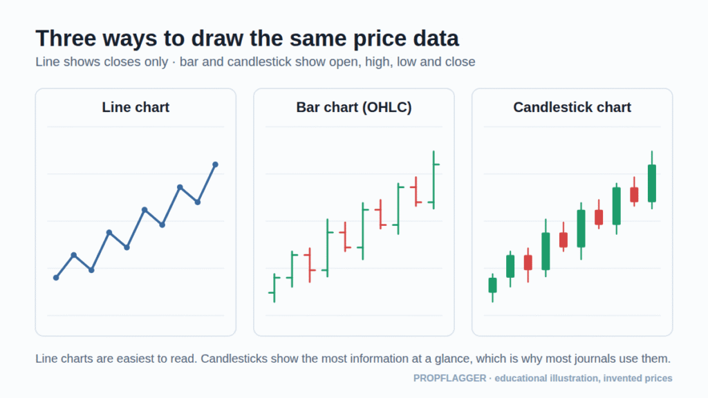
| Chart | What it shows | Best for |
|---|---|---|
| Line | Closing prices joined by a line | Seeing the big picture and the overall trend |
| Bar (OHLC) | Open, high, low and close as a vertical bar with ticks | Range and volatility of each period |
| Candlestick | The same four prices, with a coloured body | Reading buying and selling pressure at a glance |
Most journals and trading platforms default to candlesticks, so the rest of this guide uses them.
How do you read a candlestick?
Each candle summarises one period of time. The thick part is the body: it spans from the open to the close. The thin lines are the wicks (or shadows): they reach up to the period’s high and down to its low.
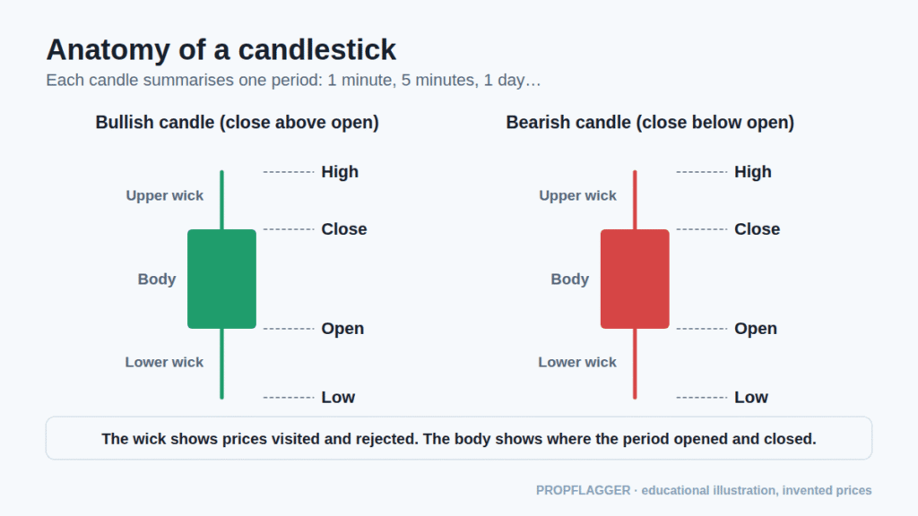
- Bullish candle: the close is above the open (usually drawn green or white).
- Bearish candle: the close is below the open (usually drawn red or black).
- Long wick: price travelled there and was pushed back before the period ended.
- Small body: the market was indecisive; open and close were near each other.
How can you tell the trend on a chart?
A trend is described by its swing points. In an uptrend, each swing high and swing low is higher than the one before. In a downtrend, they are each lower. When highs and lows stay inside a band, the market is ranging.
This idea comes from Dow Theory and is the foundation of what traders call market structure.
What are support and resistance?
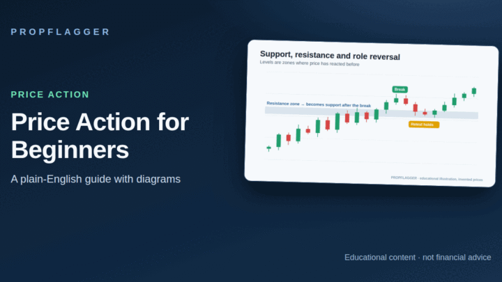
Support is a price area where falling prices have paused or turned up before. Resistance is an area where rising prices have paused or turned down. They are zones rather than exact lines. Once a level breaks, it often becomes important from the other side, a pattern known as role reversal. See price action for beginners for how traders use levels with candle patterns.
Why use more than one timeframe?
A single chart can mislead. A pullback on a five-minute chart may be a tiny wiggle inside a strong daily trend, or the start of a larger reversal. Looking at several timeframes, often called multiple timeframe analysis, gives context.
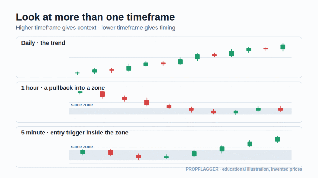
- Higher timeframe: identify the trend and the major levels.
- Middle timeframe: find the zone or area you care about.
- Lower timeframe: look for the timing of an entry and a clear place to be wrong.
A common guideline is to keep each step roughly four to six times smaller than the one above, but there is no rule you must follow. Pick a set and use it consistently.
Do indicators and volume matter?
Indicators such as moving averages, RSI or ATR are calculations on price (and sometimes volume). They can summarise trend or volatility but they do not see anything the price does not already show. Volume adds one more piece of information: how much was traded. If you add indicators, keep them few and know exactly what each one measures. For example, ATR measures typical movement, not direction.
A simple chart-reading routine
- Start on the higher timeframe. Is it trending up, down or sideways?
- Mark the most obvious swing highs, swing lows and levels.
- Note where price is now relative to those levels.
- Drop to a lower timeframe and describe what you see in one or two sentences.
- Decide in advance where the idea would be wrong and how much you would risk.
- Save the chart with your notes so you can review it later.
Common chart-reading mistakes
- Cluttered charts: too many lines and indicators hide the price.
- Hindsight: a chart always looks obvious after the move. Mark levels before the next candles appear.
- Ignoring the higher timeframe: trading a small pattern straight into a big level.
- Treating patterns as certainty: every pattern fails sometimes. That is why risk management matters.
Where does a journal fit in?
A chart you do not save is hard to learn from. Keep the original screenshot and an annotated one for every trade you take. Comparing the two later shows what you saw at the time, and what you only noticed afterwards. The trading journal guide explains what else to record.
Educational content only. Nothing here is a recommendation to buy or sell anything.
3 comments